In my last blog I wrote about the importance of the right paper for the right subject matter- and how important paper is to a pastellist. In this blog I'm going to begin a conversation about layers. For further information about me, visit my website
www.sandraorme.co.uk or
www.facebook.com/SandraOrmePastelOriginals
One of my greatest pleasures of working with pastels is layers- most of my work contains layer upon layers. I love the challenge of mixing harmonious, complementary or contrasting colours to create wonderful tints and shades. (Yes, you will need a working knowledge of colour theory). I think its vital to do this to create a truly natural feel to things like clouds, moors or seas: layers let you capture that multiplicity of tones and movement that then underpins the detail that can drawn on top.
When I start a piece, I begin with very thin layers of vibrant colour- stronger than the colours I eventually want to dominate the piece. I do this because I want this vibrant colour to tint and affect the more realistic tones I put on top. This will help create a wonderful range of tones and also give a backlit, more dramatic feel to the more realistic colours.
For example, I choose a colour scheme- say, turquoise for a seascape- and then even any grey clouds in the work have vibrant blues and turquoises applied before the shades of grey are put on top. As a general rule I use at least 6 to 8 pastels colours for something as simple as grey cloud: 3 or 4 vibrant tones in my chosen colour scheme then 3 or 4 realistic shades of grey - these are then blended to interact together.
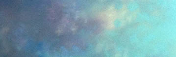 |
| blended layers of pastel showing creation of multiplicity of tints and shades. |
So, we now have thin layers of vibrant colour followed by thin layers of your realistic colours ideally in good quality pastels- and when I say THIN layers, this is important and I need you to pay attention. It's so easy to be heavy handed with pastels- and a light pressure using the side of the pastel needs to be used when working with my layering technique.
Those of you who can't bear to take the wrapper off your gorgeous new pastel and then snap it in half (you know who you are) ... this technique is not for you. Working this way, you won't fill the tooth of the paper too quickly, you can build layers of colour on your good pastel paper with your beautiful soft pastels. Just remember your three P's : Paper, Pressure, Pastels.
Of course I should really throw in Layers in with that but it's not quite as catchy... PPLP? No.
If you are working on
Sennelier Pastel Card then you continue to build layers gently using different directions and mark making until happy with what should be expressive, textured and semi-abstract results. Do not blend on this paper. In my opinion the minute you do so you have wasted your money on some expensive but beautifully textured paper, on which you have now created a permanently blurred image (this may of course be your 'thing' so it that case..) I think the whole point of this paper is that texture- do your best to keep it, don't overfill it and DO NOT blend on it.
On
Clairefontaine Pastel Mat however, now is the time to blend and it is a sheer pleasure. I love watching the colours mix, mingle and interact to create new and exciting tints and shades- from 8 colours can come 24 different shades and effects. Some pastellists spray between layers of colours- that is not my thing at all- I want the colours to work together and affect each other. If you find the pastels don't blend readily then you don't have enough on. Repeat your colours until the surface begins to drag rather than looked textured - you may then be ready to blend. Be patient.
Ooh, is that 4 P's now? Paper, Pressure, Pastels, Patience- I may be on to something here...
At the blending stage, it's important to again think about pressure- but this time it's the pressure of your fingers. You have total control over how the pastels blend with each other purely by applying less or more pressure. More pressure and the colours underneath will rise more to the surface and affect the colours you've put on top- and the less dominant those surface colours with be. Less pressure and the surface colours dominate. You can also start to control the direction and movement of the marks you create - but I will address how I work with that in future blogs.
The last but not least word on layers needs to be about the pastels themselves. With the right 'toothy' paper, you can potentially create and use layers. However, without the right pastels, it doesn't matter how good the paper is. I use Inscribe pastels; cheap, cheerfully vibrant but without graininess, for my initial vibrant layers. After that though and for the rest of the work, I use glorious
Unison Pastels- in my opinion probably the best pastels out there
(Is there anything better than opening up a brand new set of Unsion Pastels and seeing them cradled in their foam alcoves, looking like the most delicious exotically coloured sweets? - I have to remind myself not to eat them every time). They are almost buttery and creamy. Beautifully smooth and soft with an amazing range of subtle or strong shades. You need this quality of pastel to create layers. The tooth of the paper will be filled fairly quickly so these creamy pastels then bind and work with both the paper and each other - this means you can happily carry on building many many layers.
Next time, more about layers and pastels- looking in more detail at texture, detail and mark-making- with a side swipe at a must have colour shaper...


Hi Sandra,
ReplyDeleteI am using U Art 400 grit sanded pastel paper. Can I use the same layering technique you are recommending ? Thanks Dan
Hi Dan, yes that should work fine on that. Its not a paper I've used much myself but I believe its similar to Fisher 400 paper. The only challenge you may find is fine details and slight issue with colour control. I find on Fisher paper it doesn't work well for things that need precision colour control- for example fiddly sunset details. However its great for stormy clouds with lots of movement.
DeleteThanks Sandra.
Delete